iOS 7, Windows Phone 8, and BlackBerry 10 operating systems each break new ground. They are a rethink of how mobile interaction paradigms should work, and each comes to a different conclusion. These four operating systems are the product of thousands of hours of research, and draw on insights from some of humanity’s foremost Human-Computer Interaction (HCI) thinkers. What can we learn from the way they tackle problems, and how can we use these insights to inform our own smartphone web development?
Windows 8 OS: An Exercise in what not to do
While Windows 8 may not hold much water with usability expert Jakob Nielsen, other critics have lauded the innovative visual style. Unfortunately, praise was relatively short-lived: most users of Windows 8 have described the experience as “initially fun, rapidly bewildering”. Many a UX designer has pointed to the problems intrinsic to Windows 8: the split visual style of Metro and the Windows 7-esque desktop; the overwhelming use of colour; and the hiding of many vital system features (such as the oft-forgotten ‘Charms’ bar). Graphic designers love the bold, blocky visuals, but most accept that this does little to make the operating system easy to use.
The main insight we can draw from Windows 8 makes reference to the law of prägnanz: we tend to order experiences regularly, symmetrically, and visually speaking, in groups. Small differences in regular patterns highlight important features. Windows 8 utterly disregards this rule: the live tiles are user-orderable, and don’t impose or offer any sort of grouping based on tile function. Home pages are split by wide gaps, but there’s no reason to differentiate home pages at all (this is a straight-up violation of the law of proximity).
Lesson: adhere by the law of prägnanz: impose visual order based on underlying function.
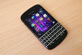
BlackBerry 10 OS: Every trick in the book
TheBlackBerry 10 OS is an exciting platform for smartphone developers. It’s absurdly well-documented, and offers a wide range of detailed sample apps. It also makes use of innovative gesture-driven interaction paradigms to keep the experience fluid. That last point is what we’ll address here.
The touch-screen brings a whole new set of interaction ideas to the table: pinch-to-zoom, flick-to-scroll, and so on. BlackBerry 10 excels in using these, partnering them with powerful, on-device multitasking to give users an unparalleled level of control over their workflow.
With so much UX focus on elegance and simplicity these days, it’s easy to miss the wisdom of computer mouse inventor Doug Engelbart, who passed away on 3 July, 2013. His ethos was not one of user-friendliness, but of user expertise. He was surprised that his great invention wound up with only two buttons, when he felt that many more would offer trained users greater control over their operating system of choice. BlackBerry knows that power-users are grown, and is comfortable to ply consumers with a few dozen gestures until they know how to use them all for maximum effect.
Lesson: complexity is OK, especially if there’s a well-structured learning curve.
Apple iOS 7: less is more, if you know what I mean
With Scott Forstall’s skeumorphic swansong out of the way, Apple has tasked master industrial designer, Jonny Ive, with the creation of a new design style for Apple’s next-generation mobile operating system. He has brought his trademark minimalism to bear, stripping out unnecessary visual ornamentation, in favour of a clean, information-focused interface.
Minimal design is very vogue at the moment – if you haven’t already noticed, flat design is currently rocking the web design community – but Apple doesn’t just value visual simplicity; we can learn a lot more than the modernist “less is more” philosophy, here.
One of the most valuable insights iOS 7 offers is how to use transitions – 3D effects and opacity layers (the old ‘bells and whistles) – to help orient the user in a visually sparse environment. The slightly opaque frosting to the Control Center, for example, indicates that the control pane is temporarily imposed on top of existing content, not replacing it:
Lesson: visually sparse environments require out-of-box thinking to help users orient themselves.