Sooner or later, every living room needs a redoing. This is imminent, whether you are not satisfied with the current setting, or you simply think that it is time for a change. No matter the reason, in case that you lack motivation, we got you covered on this. Here are several suggestions on how to breathe in a new life to your home.

White on White
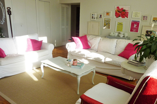
Straight of the bat, the hardest problem to tackle with, having completely white room is not an easy task. In order to break out pale and unanimated space, introduce different textures in your room. What you lack in colour department, you may compensate in dimension and relief motifs. Crochet is one of the most common ways to avoid this, so choose where to apply it, and be modest, several details are enough. One more secret which will help you to achieve looks of the Versailles, instead of a sanatorium, is to introduce several very subtle golden details. An edge of the pillow and the top of the lamp cover will look marvellous.

Strong Flowers
For the past several years flower motifs and prints are quite trendy. But, one thing must be taken into consideration. Do not overextend the usage of these prints, for they will simply “drown” the room. It would be much wiser to have several prints, but evenly spread out. For example, if you have purple flower prints, paint your room in the similar colour, but darker shade, and from the same material make a stool cover and a pillow. It would be cat’s whiskers if you could find the same flower as it is on the print, and put it into a transparent crystal vase at the table. Stronger colour of the walls will emphasize the prints, giving them the spot, but not the entire place.

Cosy Corner
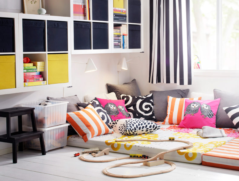
With this approach, your toys will be pieces of furniture, rather than colours and textures. Surely, you can add up to the overall impression by opting for a fuzzy carpet, but keep those details at minimum. A nice sofa, with the mountain of pillows (the best approach is to have two similar sets), paired with a nice armchair or the rocker of the same colour will contribute to this impression. Although not of primary concern, colours are also important, so take into consideration darker shades of orange, violet, or red. Mind the details, so bookshelf of dark wood will fit in perfectly. In general, avoid using gadgets and modern technology, it somehow ruins the whole impression.

Futuristic
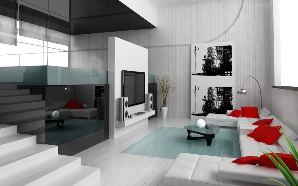
A style completely opposite of the previous one, it is pale, sharp and metallic. It can come down to several colours, ranging from black, white, and all the spectrum of gray, silver and metal-ish tones. It is also somewhat minimalistic, so any pictures should be taken down to the form of shapes and lines. Technology fits this style perfectly, as we have been said by one of the best home theatre installers in Sydney, because people often ask for a huge TV to dominate the space. Brushed aluminum is your best friend here, but keep it in control. You do not want to end up with the gritty look.
To conclude all of the things said above, you can follow any of predefined styles, or you can always make up your own. Who knows, maybe there is a designer hiding in you?

